12. モザイクプロット#
12.1. 概要#
モザイクプロット(Mosaic Plot) とは,複数の質的変数に対して,その比率を 長方形の面積 で表したグラフです. その見た目から マリメッコプロット(Marimekko Plot) とも呼ばれます. 分割方法を工夫することで三変数以上にも対応可能ですが,よく見かけるのは二変数に対する描画です.
二変数に対するモザイクプロットは,積上げ棒グラフの棒の太さを,分母の大きさで調整したものと捉えることができます. これにより,二変数を跨いだ(他の棒中の要素との)比較が可能になりますが,目視で面積を測るのは難しい場合があるので,数値を付記すると親切です.
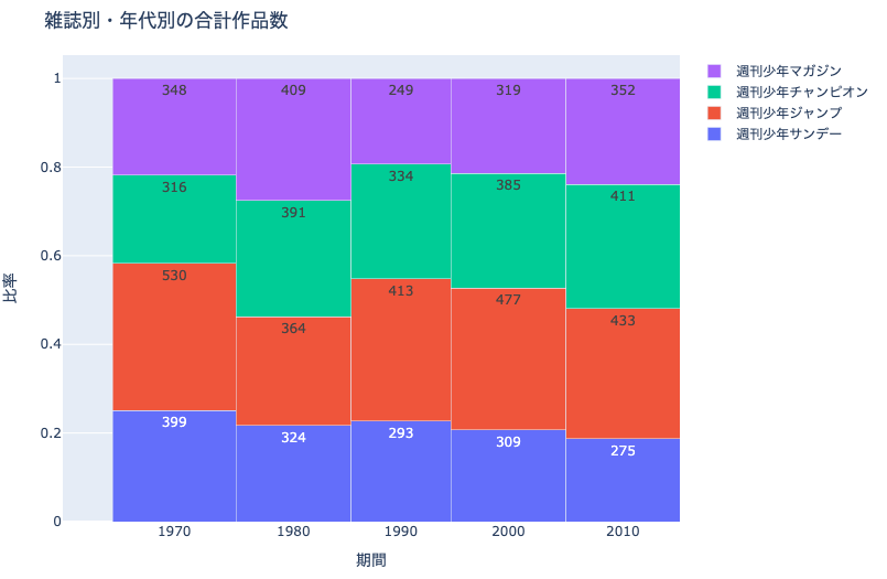
例えば上記は,雑誌別・年代別の作品数の比率を表したモザイクプロットです. 年代ごとの合計作品数に応じて,縦方向の棒の太さが変わっていることがわかります.
12.2. Plotlyによる作図方法#
Plotlyで直接モザイクプロットを描画する方法はありません. こちらを参考に,棒グラフを応用して作図します. 非常に複雑なので,以下の作図例にコメントを入れる形で解説します.
12.3. MADB Labを用いた作図例#
12.3.1. 下準備#
import pandas as pd
import plotly.express as px
import plotly.graph_objects as go
import warnings
warnings.filterwarnings('ignore')
# 前処理の結果,以下に分析対象ファイルが格納されていることを想定
PATH_DATA = '../../data/preprocess/out/episodes.csv'
# Jupyter Book用のPlotlyのrenderer
RENDERER = 'plotly_mimetype+notebook'
def add_years_to_df(df, unit_years=10):
"""unit_years単位で区切ったyears列を追加"""
df_new = df.copy()
df_new['years'] = \
pd.to_datetime(df['datePublished']).dt.year \
// unit_years * unit_years
df_new['years'] = df_new['years'].astype(str)
return df_new
def show_fig(fig):
"""Jupyter Bookでも表示可能なようRendererを指定"""
fig.update_layout(margin=dict(t=50, l=25, r=25, b=25))
fig.show(renderer=RENDERER)
df = pd.read_csv(PATH_DATA)
12.3.2. 雑誌別・年代別の合計作品数#
col_count = 'cname'
# 10年単位で区切ったyearsを追加
df = add_years_to_df(df, 10)
# mcname, yearsで集計
df_plot = \
df.groupby(['mcname', 'years'])[col_count].\
nunique().reset_index()
# years単位で集計してdf_plotにカラムを追加
df_tmp = df_plot.groupby('years')[col_count].sum().reset_index(
name='years_total')
df_plot = pd.merge(df_plot, df_tmp, how='left', on='years')
# years合計あたりの比率を計算
# 棒グラフの太さを調整する際に利用する
df_plot['ratio'] = df_plot[col_count] / df_plot['years_total']
fig = go.Figure()
for mcname in df_plot['mcname'].unique():
df_tmp = \
df_plot[df_plot['mcname']==mcname].reset_index(drop=True)
widths = df_tmp['years_total']
fig.add_trace(go.Bar(
name=mcname,
# X軸方向の位置を,棒グラフの太さを考慮して調整
x=df_tmp['years_total'].cumsum() - widths,
y=df_tmp['ratio'], text=df_tmp[col_count],
# 棒グラフの太さを調整
width=widths,
offset=0,))
fig.update_xaxes(
# X軸の目盛りの位置を,棒グラフの太さを考慮して調整
tickvals=widths.cumsum() - widths/2,
ticktext=df_plot['years'].unique(),)
fig.update_xaxes(title='期間')
fig.update_yaxes(title='比率')
# go.Barを積み上げる設定
fig.update_layout(barmode='stack', title_text='雑誌別・年代別の合計作品数')
show_fig(fig)
12.3.3. 雑誌別・年代別の合計作家数#
col_count = 'creator'
# 10年単位で区切ったyearsを追加
df = add_years_to_df(df, 10)
# mcname, yearsで集計
df_plot = \
df.groupby(['mcname', 'years'])[col_count].\
nunique().reset_index()
# years単位で集計してdf_plotにカラムを追加
df_tmp = df_plot.groupby('years')[col_count].sum().reset_index(
name='years_total')
df_plot = pd.merge(df_plot, df_tmp, how='left', on='years')
# years合計あたりの比率を計算
# 棒グラフの太さを調整する際に利用
df_plot['ratio'] = df_plot[col_count] / df_plot['years_total']
fig = go.Figure()
for mcname in df_plot['mcname'].unique():
df_tmp = \
df_plot[df_plot['mcname']==mcname].reset_index(drop=True)
widths = df_tmp['years_total']
fig.add_trace(go.Bar(
name=mcname,
# 棒グラフの太さを考慮してX軸方向の位置を調整
x=df_tmp['years_total'].cumsum() - widths,
y=df_tmp['ratio'], text=df_tmp[col_count],
# 棒グラフの太さを調整
width=widths,
offset=0,))
fig.update_xaxes(
# 棒グラフの太さを考慮してX軸の目盛りの位置を調整
tickvals=widths.cumsum() - widths/2,
ticktext=df_plot['years'].unique(),)
fig.update_xaxes(title='期間')
fig.update_yaxes(title='比率')
# go.Bar()を積み上げる設定
fig.update_layout(
barmode='stack', title_text='雑誌別・年代別の合計作家数')
show_fig(fig)