10. 棒グラフ#
10.1. 概要#
質的変数の比率を見る際にも 棒グラフ は有用です. この用途でよく用いられるのは,縦横反転した積上げ棒グラフです.
例えば上図は,雑誌別の合計作品数のシェアを表す棒グラフです. 円グラフと同様,個別の雑誌の全体に占める割合はなんとなくわかりますが,雑誌同士の比較は(数値を見なければ)難しいです.
10.2. Plotlyによる作図方法#
「量を見たい」の棒グラフと基本的に同じです.
import plotly.express as px
fig = px.bar(
df, x='col_x', y='col_y', orientation='h', text='col_text',
color='col_group', barmode='stack')
上記の例では,dfのcol_x列を横軸に,col_y列を縦軸に取った棒グラフオブジェクトfigを作成します.
ただし,col_yは合計値が1となるよう事前に調整が必要です.
orientation='h'で縦横を反転しています.ひと目で各要素の比率は分かりづらいので,col_text列で割合を表示すると親切です.
10.3. MADB Labを用いた作図例#
10.3.1. 下準備#
import pandas as pd
import plotly.express as px
import warnings
warnings.filterwarnings('ignore')
# 前処理の結果,以下に分析対象ファイルが格納されていることを想定
PATH_DATA = '../../data/preprocess/out/episodes.csv'
# Jupyter Book用のPlotlyのrenderer
RENDERER = 'plotly_mimetype+notebook'
def add_years_to_df(df, unit_years=10):
"""unit_years単位で区切ったyears列を追加"""
df_new = df.copy()
df_new['years'] = \
pd.to_datetime(df['datePublished']).dt.year \
// unit_years * unit_years
df_new['years'] = df_new['years'].astype(str)
return df_new
def show_fig(fig):
"""Jupyter Bookでも表示可能なようRendererを指定"""
fig.update_layout(margin=dict(t=50, l=25, r=25, b=25))
fig.show(renderer=RENDERER)
df = pd.read_csv(PATH_DATA)
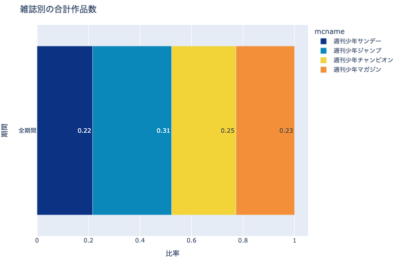
10.3.2. 雑誌別の合計作品数#
col_count = 'cname'
df_plot = \
df.groupby('mcname')[col_count].nunique().reset_index()
df_plot['ratio'] = df_plot[col_count] / df_plot[col_count].sum()
df_plot['years'] = '全期間'
df_plot['text'] = df_plot['ratio'].apply(
lambda x: f'{x:.2}')
fig = px.bar(
df_plot, x='ratio', y='years', barmode='stack',
color='mcname', orientation='h', text='text',
color_discrete_sequence= px.colors.diverging.Portland,
title='雑誌別の合計作品数')
fig.update_xaxes(title='比率')
fig.update_yaxes(title='期間')
show_fig(fig)
おおよそ各雑誌が1/4程度ずつシェアを持っていることはわかりますが,(数値を見なければ)各雑誌の大小関係は一目ではわかりません.
10.3.3. 雑誌別・年代別の合計作品数#
col_count = 'cname'
# 10年単位で区切ったyearsを追加
df = add_years_to_df(df, 10)
# mcname, yearsで集計
df_plot = \
df.groupby(['mcname', 'years'])[col_count].\
nunique().reset_index()
# years単位で集計してdf_plotにカラムを追加
df_tmp = df_plot.groupby('years')[col_count].sum().reset_index(
name='years_total')
df_plot = pd.merge(df_plot, df_tmp, how='left', on='years')
# years合計あたりの比率を計算
df_plot['ratio'] = df_plot[col_count] / df_plot['years_total']
df_plot['text'] = df_plot['ratio'].apply(
lambda x: f'{x:.2}')
fig = px.bar(
df_plot, y='years', x='ratio', color='mcname', text='text',
color_discrete_sequence= px.colors.diverging.Portland,
barmode='stack', title='雑誌別・年代別の合計作品数')
fig.update_xaxes(title='期間')
fig.update_yaxes(title='比率')
show_fig(fig)
年代ごとに雑誌のシェアの変遷が定性的にはわかります.
また,左端の週刊少年サンデーおよび右端の週刊少年マガジンに関しては,シェアの推移もわかります.
しかし,週刊少年ジャンプおよび週刊少年チャンピオンに関しては,シェアが増えたのか減ったのか,(数値を見なければ)わかりません.
10.3.4. 雑誌別の合計作者数#
同様に作家数に関しても集計します.
col_count = 'creator'
df_plot = \
df.groupby('mcname')[col_count].nunique().reset_index()
df_plot['ratio'] = df_plot[col_count] / df_plot[col_count].sum()
df_plot['years'] = '全期間'
df_plot['text'] = df_plot['ratio'].apply(
lambda x: f'{x:.2}')
fig = px.bar(
df_plot, x='ratio', y='years', barmode='stack', text='text',
color_discrete_sequence= px.colors.diverging.Portland,
color='mcname', title='雑誌別の合計作者数')
fig.update_xaxes(title='比率')
fig.update_yaxes(title='期間')
show_fig(fig)
10.3.5. 雑誌別・年代別の合計作者数#
col_count = 'creator'
# 10年単位で区切ったyearsを追加
df = add_years_to_df(df, 10)
# mcname, yearsで集計
df_plot = \
df.groupby(['mcname', 'years'])[col_count].\
nunique().reset_index()
# years単位で集計してdf_plotにカラムを追加
df_tmp = df_plot.groupby('years')[col_count].sum().reset_index(
name='years_total')
df_plot = pd.merge(df_plot, df_tmp, how='left', on='years')
# years合計あたりの比率を計算
df_plot['ratio'] = df_plot[col_count] / df_plot['years_total']
df_plot['text'] = df_plot['ratio'].apply(
lambda x: f'{x:.2}')
fig = px.bar(
df_plot, y='years', x='ratio', color='mcname',
text='text', orientation='h',
color_discrete_sequence= px.colors.diverging.Portland,
barmode='stack', title='雑誌別・年代別の合計作者数')
fig.update_xaxes(title='比率')
fig.update_yaxes(title='期間')
show_fig(fig)