1. 棒グラフ#
1.1. 概要#
棒グラフ(Bar Chart) とは,主に質的変数を対象にして,棒の長さで数量を表すグラフです.棒を縦方向に並べることもありますし,横方向に並べることもあります.質的変数の量を見る最も一般的な方法の一つです.
例えば上図は,作品ごとの合計掲載週数を表した棒グラフです. なお,棒グラフにはいくつか種類がありますが,このページでは積上げ棒グラフと集合棒グラフについて紹介します.
集合棒グラフ(Grouped Bar Chart) とは,下図のように変数の値に応じてグループ化し, 横に 並べた棒グラフです.
積上げ棒グラフ(Stacked Bar Chart) とは,下図のように変数の値に応じてグループ化し, 縦に 積み上げた棒グラフです.
1.2. Plotlyによる作図方法#
Plotlyではplotly.express.bar()で棒グラフを作成可能です.
import plotly.express as px
fig = px.bar(df, x='col_x', y='col_y')
上記の例では,dfのcol_x列を横軸,col_y列を縦軸とした棒グラフのオブジェクトfigを作成します.また,
import plotly.express as px
fig = px.bar(
df, x='col_x', y='col_y',
color='col_group', barmode='group')
上記のようにbarmode='group'を指定することでcol_groupでグループ化可能です.さらに,
import plotly.express as px
fig = px.bar(
df, x='col_x', y='col_y',
color='col_group', barmode='stack')
上記のようにbarmode='stack'を指定することでcol_groupで積み上げた棒グラフを作成可能です.
1.3. MADB Labを用いた作図例#
1.3.1. 下準備#
import itertools
import pandas as pd
import plotly.express as px
import warnings
warnings.filterwarnings('ignore')
# 前処理の結果,以下に分析対象ファイルが格納されていることを想定
PATH_DATA = '../../data/preprocess/out/episodes.csv'
# Jupyter Book用のPlotlyのrenderer
RENDERER = 'plotly_mimetype+notebook'
def show_fig(fig):
"""Jupyter Bookでも表示可能なようRendererを指定"""
fig.update_layout(margin=dict(t=50, l=25, r=25, b=25))
fig.show(renderer=RENDERER)
def add_years_to_df(df, unit_years=10):
"""unit_years単位で区切ったyears列を追加"""
df_new = df.copy()
df_new['years'] = \
pd.to_datetime(df['datePublished']).dt.year \
// unit_years * unit_years
df_new['years'] = df_new['years'].astype(str)
return df_new
def resample_df_by_cname_and_years(df):
"""cnameとyearsのすべての組み合わせが存在するように0埋め
この処理を実施しないと作図時にX軸方向の順序が変わってしまう"""
df_new = df.copy()
yearss = df['years'].unique()
cnames = df['cname'].unique()
for cname, years in itertools.product(cnames, yearss):
df_tmp = df_new[
(df_new['cname'] == cname)&\
(df_new['years'] == years)]
if df_tmp.shape[0] == 0:
s = pd.Series(
{'cname': cname,
'years': years,
'weeks': 0,},
index=df_tmp.columns)
df_new = df_new.append(
s, ignore_index=True)
return df_new
def resample_df_by_creator_and_years(df):
"""creatorとyearsのすべての組み合わせが存在するように0埋め
この処理を実施しないと作図時にX軸方向の順序が変わってしまう"""
df_new = df.copy()
yearss = df['years'].unique()
creators = df['creator'].unique()
for creator, years in itertools.product(creators, yearss):
df_tmp = df_new[
(df_new['creator'] == creator)&\
(df_new['years'] == years)]
if df_tmp.shape[0] == 0:
s = pd.Series(
{'creator': creator,
'years': years,
'weeks': 0,},
index=df_tmp.columns)
df_new = df_new.append(
s, ignore_index=True)
return df_new
df = pd.read_csv(PATH_DATA)
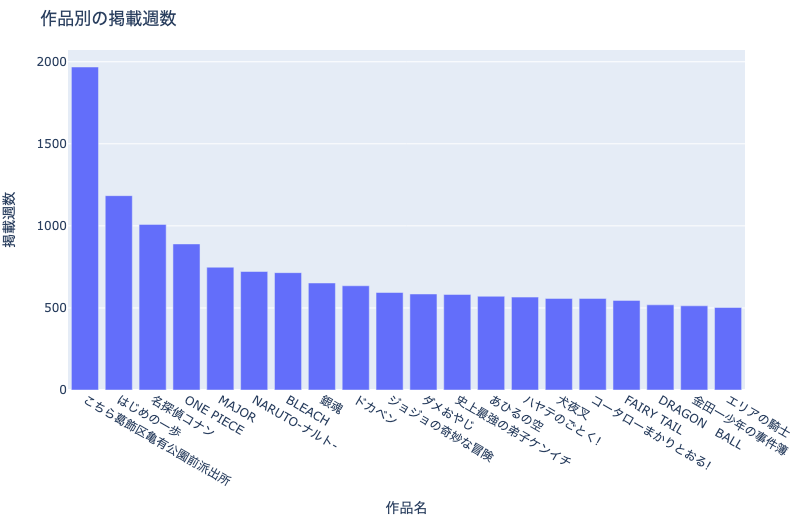
1.3.2. 作品別の掲載週数(上位20作品)#
まずは,作品ごとの掲載週数を見てみましょう.
df_plot = df.value_counts('cname').reset_index(name='weeks').head(20)
fig = px.bar(df_plot, x='cname', y='weeks',
title='作品別の掲載週数')
fig.update_xaxes(title='作品名')
fig.update_yaxes(title='掲載週数')
show_fig(fig)
各雑誌・各世代を代表するような作品が並びます.こちら葛飾区亀有公園前派出所は流石ですね….
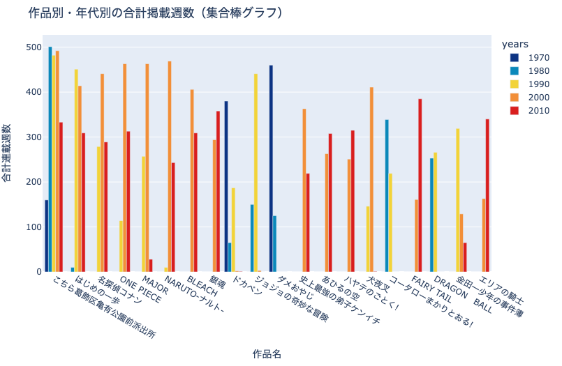
1.3.3. 作品別・年代別の掲載週数(上位20作品)#
では,上記の作品はいつ頃掲載されたものなのでしょうか?ここでは:
集合棒グラフ(グループ化された棒グラフ)
積上げ棒グラフ
を使って,作品別・年代別の合計掲載週を可視化します.
# dfに10年区切りの年代情報を追加
df = add_years_to_df(df)
# プロット用に集計
df_plot = df.groupby('cname')['years'].value_counts().\
reset_index(name='weeks')
# 連載週数上位20作品を抽出
cnames = list(df.value_counts('cname').head(20).index)
df_plot = df_plot[df_plot['cname'].isin(cnames)].\
reset_index(drop=True)
# cname,yearsでアップサンプリング
df_plot = resample_df_by_cname_and_years(df_plot)
# 合計連載週数で降順ソート
df_plot['order'] = df_plot['cname'].apply(
lambda x: cnames.index(x))
df_plot = df_plot.sort_values(
['order', 'years'], ignore_index=True)
# 作図
fig = px.bar(
df_plot, x='cname', y='weeks', color='years',
color_discrete_sequence= px.colors.diverging.Portland,
barmode='group',
title='作品別・年代別の合計掲載週数(集合棒グラフ)')
fig.update_xaxes(title='作品名')
fig.update_yaxes(title='合計連載週数')
show_fig(fig)
冒頭の棒グラフを年代ごとに分割し,作品ごとに横に並べました.このようなグラフを集合棒グラフと呼びます.
作品の掲載年に特徴が顕れており,非常に面白いですね….こちら葛飾区亀有公園前派出所がいかに長期間,コンスタントに掲載されていたかわかります.
このグラフを観察すると,集合棒グラフには次のような長所があることがわかります:
各作品・各年代の絶対値を比較しやすい
例:1970年代は
ダメおやじ,1980年代はこちら葛飾区亀有公園前派出所が代表的
各作品がどの年代に掲載されたか定性的にわかりやすい
例:
ダメおやじ等は1970-1980年代,MAJORは1990-2010年代に掲載された
一方で,次のような短所も明らかになりました:
年代の数に比例して凡例の数が増えてしまうため,全体的に棒が細くなり,視認性が悪くなる
年代をまたがった合計掲載週数の比較がしづらい
group対象に欠測があるとX軸の順序が自動調整されてしまう
おそらくpx.bar()の仕様ですが,barmode='group'あるいはbarmode='stack'を選択した際にcolorで指定した列に欠測があると,X軸の順序が変わってしまうことを確認しました.これを回避するため,resample_df_by_cname_and_years(df_plot)で欠測を補完しています.以降も同様です.
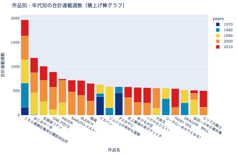
# 作図
fig = px.bar(
df_plot, x='cname', y='weeks', color='years',
color_discrete_sequence= px.colors.diverging.Portland,
barmode='stack',
title='作品別・年代別の合計連載週数(積上げ棒グラフ)')
fig.update_xaxes(title='作品名')
fig.update_yaxes(title='合計連載週数')
show_fig(fig)
こちらは同じ情報を積上げ棒グラフで可視化したものです. 積上げ棒グラフは,年代ごとの掲載数を横に並べるのではなく,縦に積上げていることにご注意ください.
積上げ棒グラフの長所は:
各作品の年代ごとの比率を比較しやすい
各作品の合計掲載週を比較しやすい
です.
積上げ棒グラフの短所は:
各作品・各年代の絶対値を比較しづらい
です.
積上げ棒グラフの特徴は集合棒グラフと表裏一体です.
1.3.4. 作家別の掲載週数(上位20名)#
同様に,作家別に掲載週数を可視化してみましょう.
df_plot = df.value_counts('creator').reset_index(name='weeks').head(20)
fig = px.bar(df_plot, x='creator', y='weeks', title='作者別の掲載週数')
fig.update_xaxes(title='作家名')
fig.update_yaxes(title='掲載週数')
show_fig(fig)
こちら葛飾区亀有公園前派出所の秋本治先生が1位と予想しておりましたが,水島新司先生が圧倒的でした.
1.3.5. 作家別・年代別の掲載週数(上位20名)#
# 10年単位で区切ったyearsを追加
df = add_years_to_df(df)
# プロット用に集計
df_plot = df.groupby('creator')['years'].value_counts().\
reset_index(name='weeks')
# 連載週刊上位20作品を抽出
creators = list(df.value_counts('creator').head(20).index)
df_plot = df_plot[df_plot['creator'].isin(creators)].\
reset_index(drop=True)
# creator,yearsでアップサンプリング
df_plot = resample_df_by_creator_and_years(df_plot)
# 合計連載週数で降順ソート
df_plot['order'] = df_plot['creator'].apply(
lambda x: creators.index(x))
df_plot = df_plot.sort_values(
['order', 'years'], ignore_index=True)
# 作図
fig = px.bar(
df_plot, x='creator', y='weeks', color='years',
color_discrete_sequence= px.colors.diverging.Portland,
barmode='group', title='作家別・年代別の掲載週数')
fig.update_xaxes(title='作家名')
fig.update_yaxes(title='掲載週数')
show_fig(fig)
# 作図
fig = px.bar(
df_plot, x='creator', y='weeks', color='years',
color_discrete_sequence= px.colors.diverging.Portland,
barmode='stack', title='作家別・年代別の掲載週数')
fig.update_xaxes(title='作家名')
fig.update_yaxes(title='掲載週数')
show_fig(fig)
1.4. 練習問題#
掲載週(
datePublished)数ではなく,作品(cname)数が多い作家を可視化してみましょう.掲載週数と比較して言えることはありますか?年代別・作品数別に積上げ棒グラフを作成して,作家毎の特徴を考察してみましょう